Tuesday, May 10, 2011

A Tribute.

So in the midst of all this reminiscing, (and the fact that I built this entire project around the idea of emotional memory recollection and revisiting some events/moments that have shaped the current state of my life) I've decided to post the original images I decided to use for my stencils. Because of the big move across the country from good ol' sunny California, I was pretty torn on what to bring with me over here, and I have to admit, a lot of personal and sentimental belongings were (regrettably) left behind.


That being said, I did manage to scrounge up a few (and email my mom for some) childhood photographs that I feel have a lot to say about what I was like as a kid.


My mom's favorite photograph of my as a kid (I'm about 3 years old):

And the other (from my senior year of college in '07):

Notice anything different?

So that's that! My piece is complete (for now, anyway), and I'm pretty pleased with how it turned out. I did give up the idea of putting lighting elements inside, especially since it was created to have translucent areas, but when I assembled the final parts of it, decided that I liked the surface and texture for what it already was, and feel like it does enough on it's own without all the effects and distractions of other elements.


Oh, Ben Tour.

I finally found the link that I'd lost a few weeks ago, when I meant to post about Canadian (born 1977) artist Ben Tour! 


Initially reeled in by his design for a new independent short film called "At Lunchtime: A Love Story," I looked up more works by this artist and discovered a quality in his paintings that gave his works visual weight in his use of vibrant colors, and organic lines and shapes, that hoped would translate in my own use of color and lines (especially in the scratches for my translucent image).


Portrait of Jade Buffalo . 2009
Mixed media on paper.
10 x 15.

Cold 2 . 2009
Ink on paper.
23 x 15.


Cited:
Thetourshow. Web. 7 May 2011. <http://www.thetourshow.com/>

Back to the '80s.

Conceptually, when I was looking at the ideas I had collected for this piece, I remembered "stumbling upon" Brazilian photographer Irina Werning's works titled "Back to the Future" (a series of photos she has continued in 2011), in which she recreates old photographs with the present-day versions of each individual.


In my hopes to create this piece around memories (including ones from childhood), I thought of the wonderfully captivating contrast, and almost eerie similarities between old and new photos in Wernings works:


Nico in 1986 & 2010.
Buenos Aires


Lali in 1978 & 2010.
Buenos Aires


And though, I'm not hoping to in any near future jump back into my 1980's clothes from my childhood, and do a vivid recreation of my childhood, I'm hoping to engage some emotional memories that'll hopefully lend something else to the piece I'm working on.


Cited:
Irina Werning - Photographer. Web. 1 May 2011. <http://irinawerning.com/>.

A bit of a setback.

So in the whirlwind of moving forward on this piece for the term, I have run into a few minor setbacks in the process:
- Oh, that Plexi-sheeting? The stuff I was ever-so-excited to use once again on my new work for the term? It doesn't want to adhere to anything. I've tried every glue in my possession. My next step will be attempting to drill into the acrylic support rods and using epoxy with my hardware to keep everything in place.
- Spray paint + acetone = amazing effects, and big gooey mess. The dry time has been a bit of a drag in wanting to move at a steady pace, so I've had to split up my work times on this project with plenty of dry time before touching it again, for fear of ruining the textures.
- Choosing 1/4" scrap pieces of plywood and luan for my framing was a bit of a mistake. Since I wanted the screw heads visible, it was difficult to glue and attach each piece without tearing through the back of the frame. My solution: grinding off the tips once the glue had dried and the pieces were completely fastened.


All in all, it's coming together. Slowly, but surely.

Tuesday, April 19, 2011

So...spray paint? I love it.

To illustrate more the look and feel of what I hope to achieve, I’ve gathered some images from one of my favorite artists: Audrey Kawasaki.

Yume No Ato

Oil on Wood 14.5x11
Four Dreams - Compound Gallery
2006


OctoGirls

Oil on wood 24x15
Venus - Roq La Rue
2006

If only I could get thin sheets of wood to make a translucent surface (although I’ll probably attempt to create a translucent wood-grain material). I would really like to play with the juxtaposition of textures, and duality in imagery.  I think that’s what I love the most about Kawasaki’s work – it’s hyper-sexualized and incorporates understated colors. There’s plenty of subtle detail and an almost eerie quality to most of her work. It’s great. I love it.

So...searching through Kawasaki's website, looking for further inspiration, I found another artist based out of NYC, Stella Im Hultberg. Born in Korea, then raised in Hong Kong, and later California, this artist was a product designer before breaking into the art. 

[This is where I would have posted photos, 
but due the inability to retrieve those images
this will stand in.]

I’m basically expanding on my spray painted heart piece from our “translations” installation. It’ll just be bigger.

Cited:
A U D R E Y * K a W a S a K I. Web. 09 Apr. 2011. <http://www.audrey-kawasaki.com/>.

Stella Im Hultberg. Web. 20 Apr. 2011. <http://www.stellaimhultberg.com/>.

Shadow art!

So in the time past our installation, I’ve been thinking practically about adding elements of lighting to my next piece for this class. This brought me to the idea of shadow, and playing with double m

Kumi Yamashita (born in Japan, 1968) uses shadows to portray various images in her sculptures.


Fred Eerdekens (born in Belgium, 1951) sculpture also uses shadows to convey imagery.

Tralalala

1999. Artificial trees, light projector
200 x 162 x 180 cm


I hate words

2005. PVC, light projector
70 x 70 x 65 cm


I think that what caught my attention from these artists is their simple message and understanding in working with negative space in order to establish the overall look of their pieces.

Having successfully incorporated lighting elements into my installation pieces, I discovered in the process how I would like it to work with the unpainted surfaces in the plexi-sheeting I hope to use for my upcoming sculpture. It’ll be a challenge, but I think the outcome will be pretty great if I can concretize my ideas.

Cited:
-  Kumi Yamashita. 09 Apr. 1993. Web. 09 Apr. 2011. <http://kumiyamashita.com/>.
- Fred Eerdekens. Web. 09 Apr. 2011. <http://www.fred-eerdekens.be/>.

Sunday, March 27, 2011

And it continues...


Continuing the stages of my sculpture pieces for the installation next week, I decided to look for inspiration in other forms for our sculpture piece for the rest of the term, and that’s when I started getting lost in looking up performance artists.

This is not to say that I’m committing to creating performing a piece that involves sculptural aspects, or that I’ll even present anything in a public performance (I think as interesting as that might be, it’s not necessarily “my thing”, nor a direction my ideas are currently headed).  I was, however, struck by the visual weight and the emotional response invoked by some performance photos that I discovered.

What I began thinking about (since we’ve been talking about “translation” for a while), was the discretion between time and visual reception of a performance. I started to think about what is lost when you merely look at images from a performance, as a opposed to the watching first hand how it is performed in person. There are the obvious experiential differences, but there are also those inherent human capabilities to “fill in the blanks” for what we do not see or witness.

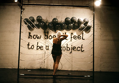
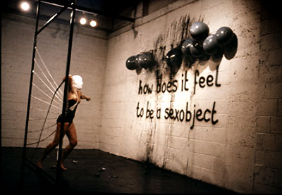
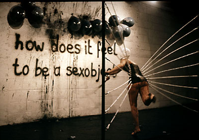
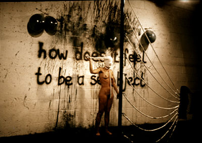
This brings me to Lydia Schouten. Born 1948 in Leiden, Netherlands, this feminist, Dutch multimedia artist uses photography, video, and performance in her pieces.


Sexobject performance, 1979
Metal frame with rubber bands and leather corset
Whipping to balloons, filled with black ink
Timespan: 30 min.
Galerie Felison, Velsen, Holland,
Project Arts Centre, Dublin, Ireland


These images just started me thinking about issues/topics I find personally interesting (…like problematizing hegemonic/normative notions gender/sex/sexuality, race, semiotics, religion, etc.).

That’s when I read this article about San Franciscan "boi culture" from New York Magazine, and started thinking about how I can give myself a more specific jumping point for my sculpture.

So the gears are turning. I’m going to give it more thought, but I’m still in the stages of collecting ideas, and thinking about ways of visually presenting something new for my new class project.


(…also, I think that whatever I chose to pursue,  it’ll probably involve spray paint. Lots of it.)


Cited:
- "L Y D I A  S C H O U T E N | Installations." Lydia Schouten · H O M E. Web. 27 Mar. 2011. <http://www.lydiaschouten.com/1_INSTALLATIONS.html>.
- Levy, Ariel. ""Where the Bois Are"" New York Magazine -- NYC Guide to Restaurants, Fashion, Nightlife, Shopping, Politics, Movies. New York Magazine. Web. 27 Mar. 2011. <http://nymag.com/nymetro/news/features/n_9709/>.