Tuesday, April 19, 2011

So...spray paint? I love it.

To illustrate more the look and feel of what I hope to achieve, I’ve gathered some images from one of my favorite artists: Audrey Kawasaki.

Yume No Ato

Oil on Wood 14.5x11
Four Dreams - Compound Gallery
2006


OctoGirls

Oil on wood 24x15
Venus - Roq La Rue
2006

If only I could get thin sheets of wood to make a translucent surface (although I’ll probably attempt to create a translucent wood-grain material). I would really like to play with the juxtaposition of textures, and duality in imagery.  I think that’s what I love the most about Kawasaki’s work – it’s hyper-sexualized and incorporates understated colors. There’s plenty of subtle detail and an almost eerie quality to most of her work. It’s great. I love it.

So...searching through Kawasaki's website, looking for further inspiration, I found another artist based out of NYC, Stella Im Hultberg. Born in Korea, then raised in Hong Kong, and later California, this artist was a product designer before breaking into the art. 

[This is where I would have posted photos, 
but due the inability to retrieve those images
this will stand in.]

I’m basically expanding on my spray painted heart piece from our “translations” installation. It’ll just be bigger.

Cited:
A U D R E Y * K a W a S a K I. Web. 09 Apr. 2011. <http://www.audrey-kawasaki.com/>.

Stella Im Hultberg. Web. 20 Apr. 2011. <http://www.stellaimhultberg.com/>.

Shadow art!

So in the time past our installation, I’ve been thinking practically about adding elements of lighting to my next piece for this class. This brought me to the idea of shadow, and playing with double m

Kumi Yamashita (born in Japan, 1968) uses shadows to portray various images in her sculptures.


Fred Eerdekens (born in Belgium, 1951) sculpture also uses shadows to convey imagery.

Tralalala

1999. Artificial trees, light projector
200 x 162 x 180 cm


I hate words

2005. PVC, light projector
70 x 70 x 65 cm


I think that what caught my attention from these artists is their simple message and understanding in working with negative space in order to establish the overall look of their pieces.

Having successfully incorporated lighting elements into my installation pieces, I discovered in the process how I would like it to work with the unpainted surfaces in the plexi-sheeting I hope to use for my upcoming sculpture. It’ll be a challenge, but I think the outcome will be pretty great if I can concretize my ideas.

Cited:
-  Kumi Yamashita. 09 Apr. 1993. Web. 09 Apr. 2011. <http://kumiyamashita.com/>.
- Fred Eerdekens. Web. 09 Apr. 2011. <http://www.fred-eerdekens.be/>.

Sunday, March 27, 2011

And it continues...


Continuing the stages of my sculpture pieces for the installation next week, I decided to look for inspiration in other forms for our sculpture piece for the rest of the term, and that’s when I started getting lost in looking up performance artists.

This is not to say that I’m committing to creating performing a piece that involves sculptural aspects, or that I’ll even present anything in a public performance (I think as interesting as that might be, it’s not necessarily “my thing”, nor a direction my ideas are currently headed).  I was, however, struck by the visual weight and the emotional response invoked by some performance photos that I discovered.

What I began thinking about (since we’ve been talking about “translation” for a while), was the discretion between time and visual reception of a performance. I started to think about what is lost when you merely look at images from a performance, as a opposed to the watching first hand how it is performed in person. There are the obvious experiential differences, but there are also those inherent human capabilities to “fill in the blanks” for what we do not see or witness.

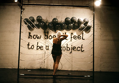
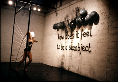
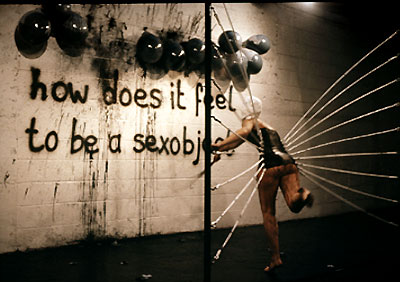
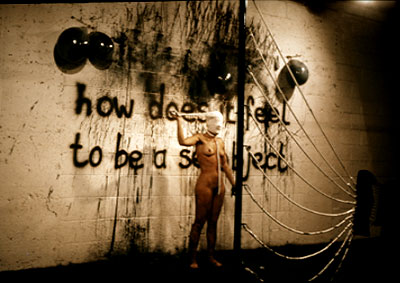
This brings me to Lydia Schouten. Born 1948 in Leiden, Netherlands, this feminist, Dutch multimedia artist uses photography, video, and performance in her pieces.


Sexobject performance, 1979
Metal frame with rubber bands and leather corset
Whipping to balloons, filled with black ink
Timespan: 30 min.
Galerie Felison, Velsen, Holland,
Project Arts Centre, Dublin, Ireland


These images just started me thinking about issues/topics I find personally interesting (…like problematizing hegemonic/normative notions gender/sex/sexuality, race, semiotics, religion, etc.).

That’s when I read this article about San Franciscan "boi culture" from New York Magazine, and started thinking about how I can give myself a more specific jumping point for my sculpture.

So the gears are turning. I’m going to give it more thought, but I’m still in the stages of collecting ideas, and thinking about ways of visually presenting something new for my new class project.


(…also, I think that whatever I chose to pursue,  it’ll probably involve spray paint. Lots of it.)


Cited:
- "L Y D I A  S C H O U T E N | Installations." Lydia Schouten · H O M E. Web. 27 Mar. 2011. <http://www.lydiaschouten.com/1_INSTALLATIONS.html>.
- Levy, Ariel. ""Where the Bois Are"" New York Magazine -- NYC Guide to Restaurants, Fashion, Nightlife, Shopping, Politics, Movies. New York Magazine. Web. 27 Mar. 2011. <http://nymag.com/nymetro/news/features/n_9709/>.


Tuesday, March 1, 2011

I’m bracing myself for break.


I know there’s still so much to be done, but here’s the short list:

  • I know I’ve subtracted the audio distraction from these boxes. But I’m leaning strongly towards a lighting element. It seems that most people’s immediate reaction (especially to all the spray painted plexi surfaces), is that I backlight it with a small bulb through the structure of the MDF.
  • Photography! There will be polaroids!
  • Texturing the hillside of my memory collage for the city of San Francisco.
  • More spray paint. So much more spray paint.
  • Covering the outsides of the boxes with...some sort of texture, or text.
I am, however, thoroughly excited about the elements i currently have in my pieces, and look forward to seeing what happens next...

Speaking of interiors and collage...


Kansas sky: Anne Hardy sculptor.

Awesome space maker. Recent works reflect interior spaces. Called “photographic paintings.” I feel like that was the unintentional result I came upon when selecting and utilizing found objects in a visual interior. Huh.

I feel like stumbling upon this given artist has justified my means of harnessing chaos into a confined space, and giving it a new context.

Here’s a few of her works:

"Detached" . 2009 .  D
    • iasec mounted c-type print

    • 123,5 x 153,5 cm


    • "Coordinate". 2009
    • Diasec mounted c-type print
      124 x 159 cm

    • "Cell" . 2004
    • diasec mounted c-type print
      120 x 150 cm


    • Cabin, 2008
    • diasec mounted c-type print
      144 x 175,5 cm


Cited:
Federica Schiavo Gallery. Web. 02 Mar. 2011. <http://www.federicaschiavo.com/Artists/Anne-Hardy/>.

Monday, February 28, 2011

In addition.

Audio as visual supplement? Or auditory distraction from visual effects?

I’m questioning the role of audio accompaniment to my installation. Somewhere in the process of compiling the visual elements of these pieces, I had a few thoughts as to its place among this visual collage. As much as I would enjoying putting together  an audio selection/piece for the installation that has more experiential dimensionality, I have concerns that it will ultimately distract our audience/viewers/guests.

I know I posted earlier about audio/poetry inspiration, but here’s another one I forgot about that I think really helped me in the process:


Cited:
"YouTube - Shira Erlichman." YouTube - Broadcast Yourself. Web. 28 Feb. 2011. <http://www.youtube.com/watch?v=4Aw6il5OEY&playnext=1&list=PLC6FD3B91BFF0C35B>.

Sunday, February 27, 2011

Rough drafting (a record of chronological progress).

9am: I got ready for an adventure at Goodwill, and a quick stop at the store for spray paint and whatever materials I think might be necessary for my project.

11am: Goodwill was a little disappointing...and thankfully they have a 7-day return policy I didn't know about prior to purchasing some electronics that I discovered did not function. But I arrived at the D&P prop shop (where all my materials are stored) to work on/edit my pieces. I quickly built the last of my MDF boxes, got a base coat in those two, and got to "filling in the gaps".

3pm: I got inspired after a brief break, and decided to use the 1/16" plexi sheeting for one of the boxes I previously had few to little three-dimensional elements involved.

For the stencil that I had previously cut out, I searched the web for “anatomical heart” imagery, and discovered a VectorStock, a website that distributed free images designed by various graphic artists that are available for all types of image references.

From there, I grabbed spray paint and started playing with layering and texturing. Pleased with the results from just a half an hour of rigorous painting, I sealed them with a coat of clear, and took them to the band-saw to cut out geometric pieces for my heart collage on the white base.

5pm: I am absolutely thrilled. I’ve decided to call it quits for the evening, and take some time to do some blogging, thinking, planning, and editing. I think if I went back into the shop to do more work, I would clutter the work I’ve done so far, so it seems a smart move to walk away from it.

For next time: I’ve definitely got a more finite plan of attack on the last few bits of my installation pieces before/during the Spring Break. However, due to my lack of funds, I will have to secure some more materials, and wait for a few special shipments to come in before I can complete the last box.